DEFINING THE UX –
This festival breathes life into the dreary minds of alternative people alike, a collective collaboration of cult classic/independent films and music from a wide range of ghoul-tastic bands. This celebration of events takes place over three days, all are welcome.
The target audience for this festival are likely to be alternative individuals, or people with a general interest in the darker side of media however other stakeholders will make up the audience. The individuals who will access and use the website/companion app for Macabre will include the following: sponsors of the event, participants (bands/guest appearances), stall venders.
These stakeholders have certain requirements that will need to be met. Generally for accessibility reasons, headings should be used properly along with content being organised. Text should be of a readable size for those who may have visual impairments, good contrasting colours will also help with this. Along with these requirements, the users will have expectations, there should be not further experience needed to be able to use the website/app. Over-complicating the design for aesthetic purposes, though it may be visually appealing, does not always help some individuals. A designer should always work with what the users already know and understand so their needs can be met fully. Due to this, both the website and companion app should run efficiently meaning that there should be no long delays when it comes to loading information, e.g: ordering tickets. The site and app also needs to be error tolerant, if an individual clicked on a link but did not mean to, there should be a clear way to go back to the previous page. The introduction of a ”BACK” icon would be beneficial here. The problem space is slightly different for the website and the app, the app will need to be more accessible, in terms of individuals being able to understand it, the app design needs to be familiar, or at least will not require a lot of knowledge to learn. The website will need to be engaging, understandable to those who may not have much experience with websites, due to this it needs to be adaptable to people.
REQUIREMENTS GATHERING AND ANALYSIS –
The stakeholders of this event may consider it to be a success if they have an enjoyable experience when using the website/companion app. This may be met through the use of information architecture, the implication being that it connects people to content in a way that they understand the best, using previous knowledge of websites. A hierarchy of contents is created, elements such as navigation are used to add structure. Information architecture then uses a range of information, puts it into context and organises it to make the content easier to find. The stakeholders will have assumptions around the website and design, they may assume that the design is accessible to everyone, so designers should accommodate for these pre assumptions, this way, the users needs are likely to be met.
Website and app analysis/review:
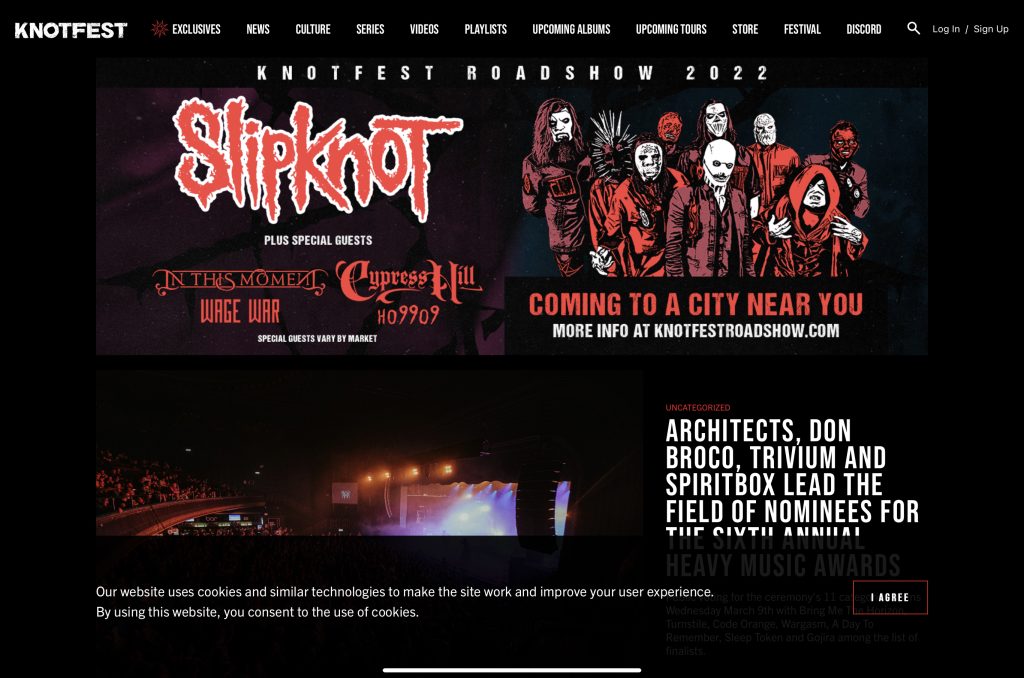
The website above is for a popular metal festival held at numerous places around the world. The hierarchy is set up differently to other websites, there does not seem to be a primary group, rather everything that would normally be in the secondary group, is located in the navigation bar. The layout itself is simple, there is only one font being used (apart from band logos). The colour pallet used is simple as well as aesthetically pleasing, as it matches the theme of the festival.
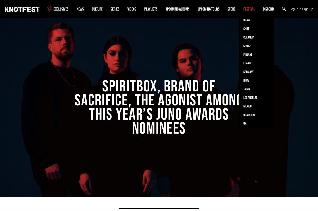
The secondary dropdown menus make navigation easy, they are simple and short to the point so an individual would know exactly what they are accessing. That being said the font is very small, anyone with visual impairments may struggle to use this feature. On the slideshow of images, the text stands out clearly, and is big enough to be accessible.
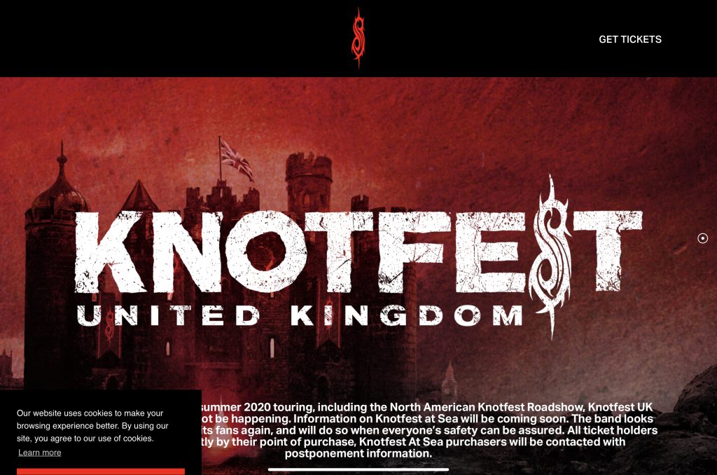
Upon clicking on one of the designated festival sites, (as shown in the screenshot above this) the user will be taken to another page in a language corresponding to the said area. from this page, individuals will be able to purchase tickets, by clicking on the link in the top right corner. Accessing this page will take them further to a page were you may order tickets. The issue with the screenshot above is, there is no obvious way of going back to the previous page. This could make an individual frustrated, they may possibly feel worried that the only way to get off the page would be to purchase tickets.
UI Principles-
The UI principles that will be used in the final designs will be as follows: visibility, using this will mean users can meet their desired goals, optimising elements of the design will do this.
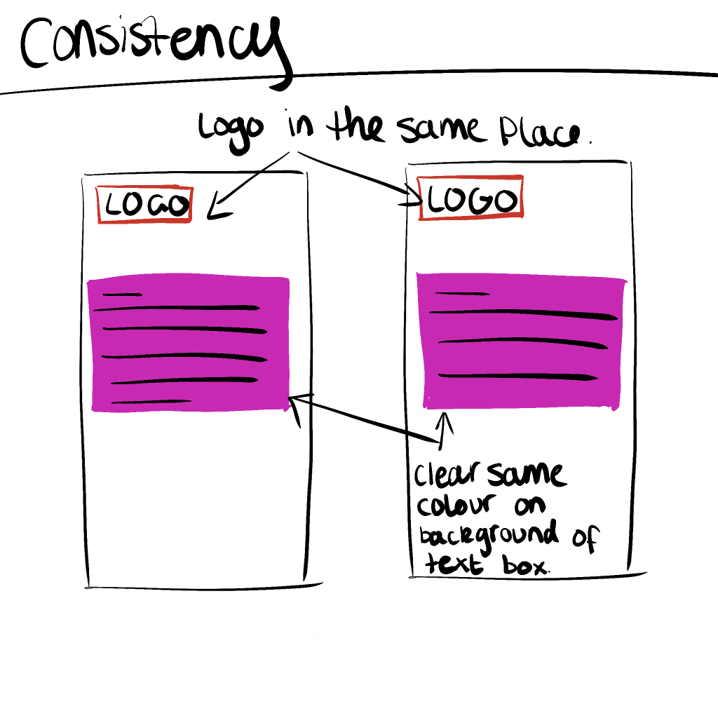
Using consistency within the designs, such as having the dropdown menu in the same place on each page, will make it so users are not confused and annoyed with their experience when using both the app and website.
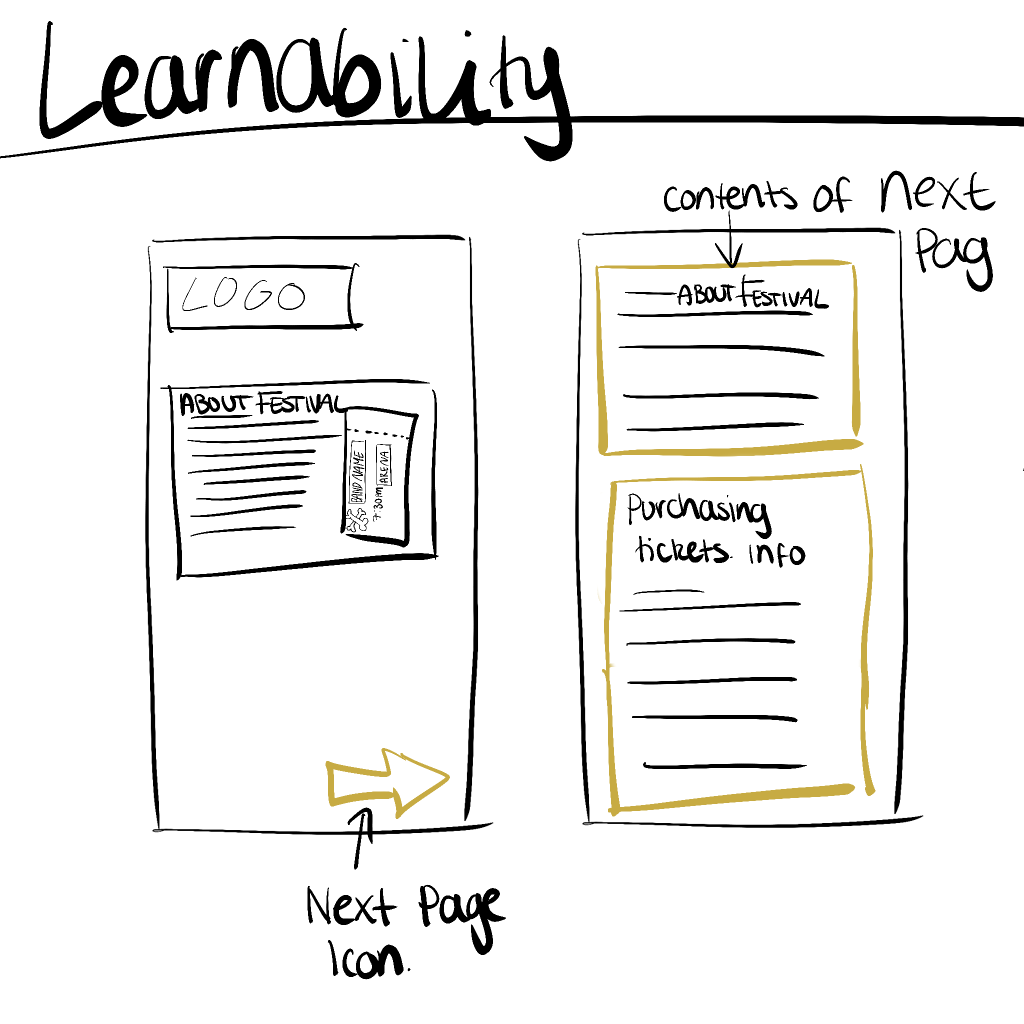
Creating an interface with the room for learnability is great for accessibility, having this in place means users do not need to have any extended knowledge. Aiding to the website and app being accessible for everyone.
REJECTED DESIGNS-
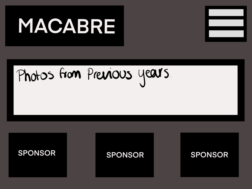
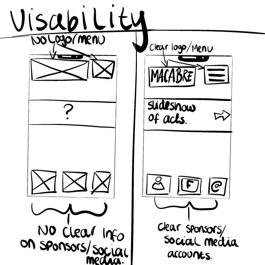
Above is a very simplistic design for ”MACABRE FESTIVAL”, it did not make the final design due to it being very basic, there is no clear usability, it would possibly require the user to have somewhat extended knowledge on how interfaces work. There has been no clear thought process gone into this design, that is visible through the simple boxes and text. The colour palette used, has no contrast other than the white, the background colour is extremely dull with this in mind it would make the experience, uninteresting, this design would not hold an individuals interest. The design may become frustrating for someone who has little to no previous interface experience. There should be clearer indications on what each part does, a user should be able to look at an interface and know straight away what each component should do. For example, a login icon, usually is very prominent on a user interface, therefore, a user will be able to achieve their desired goal more effectively and quickly.
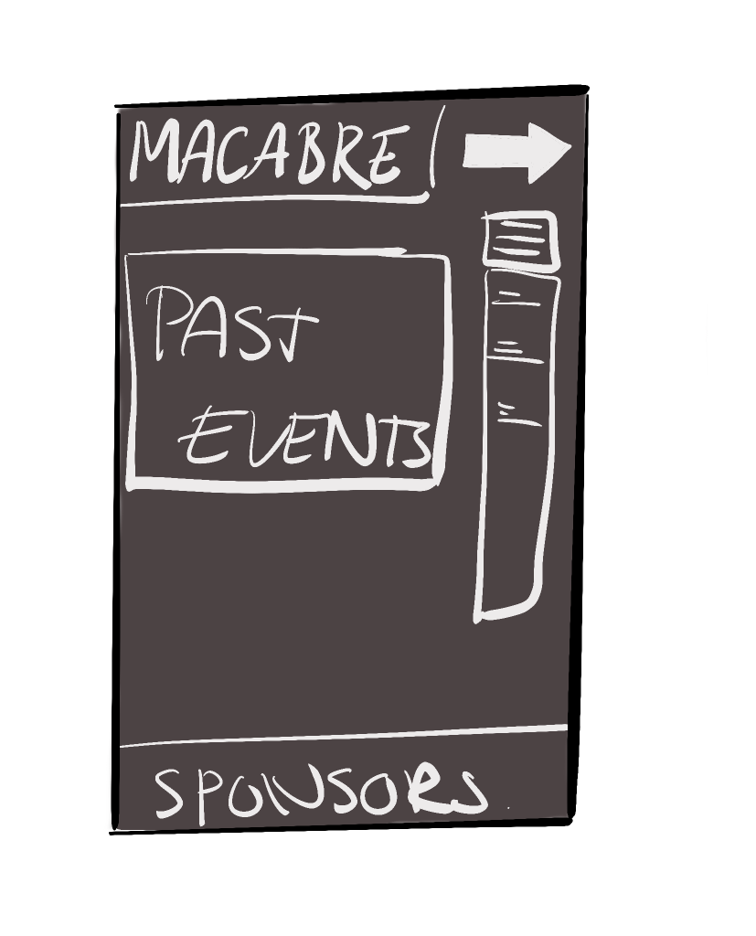
This companion app design is, much like the previous in terms of it’s simplicity. the colours once again are dull and unimpressive, an app should be fun to use, be able to provide users with a enjoyable and fulfilling experience, this design does the opposite of this. The dropdown menu is in a bad place, above it is a ”next page” icon, which would make the user feel guilty for not understanding what it means. This would also make no sense with it being on a home page, a user would need to click on a secondary link in the dropdown menu to be able to access the “next page” icon. The design shows no understanding of UI design and along with it’s lack of accessibility/usability, it would not make a good final design choice.
LOW FIDELITY UI PROTOTYPE
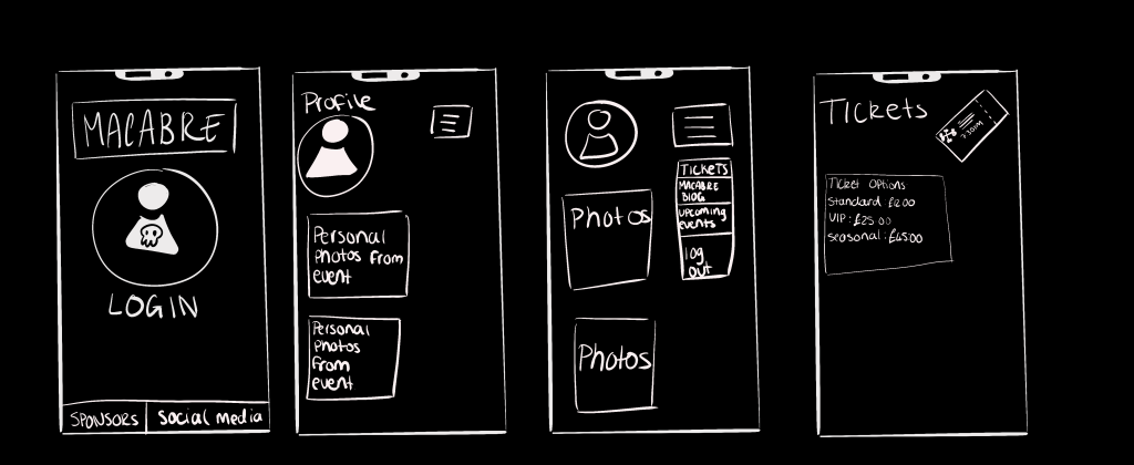
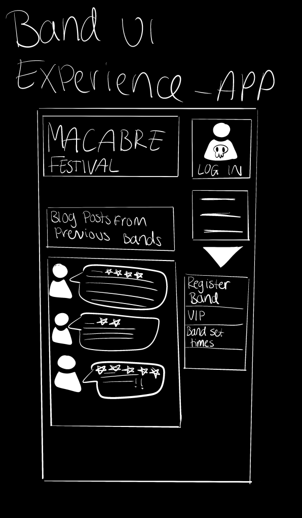
Above is a low fidelity prototype, of the companion app. I have considered, constraints within this design such as, the layout of the interface being simple and not too cluttered. Each part of the design will help the user to have a fulfilling and enjoyable experience. It requires no further knowledge to understand how to use it. The menu icon is in the top right of the page, this is usually universal across most interfaces. There is room for personalisation within this app, due to it being a blog for pre-existing members of the festival. This app interface is accessible to everyone as it is aesthetically pleasing as well as it have contrasting colours.
Morville, P. (2004) More Than Usability: The Four Elements of User Experience, Part I available at https://www.uxmatters.com/mt/archives/2012/04/more-than-usability-the-four-elements-of-user-experience-part-i. (last accessed March 2022)
Stevens, E (2021) What Is Empathy in Design Thinking? A Comprehensive Guide available at https://careerfoundry.com/en/blog/ux-design/what-is-empathy-in-design-thinking/ (last accessed March 2022)